
Half a million people talking about their mental health, publicly, in text. I wanted to know what the patterns looked like when you stopped reading individual posts and started looking at the whole picture.
I did not expect this analysis to affect me.
I have worked with datasets before. Sales data, logistics records, user behaviour logs. Numbers that represent things but feel abstract enough to stay that way. This one was different. Every row in this dataset is a person who sat down at a keyboard and wrote something honest about how they were feeling. Aggregate that across thousands of posts and you stop seeing rows. You start seeing patterns in something that is genuinely human.
That is worth saying before the code starts.
This article walks through a complete sentiment analysis of Reddit mental health data using VADER — a rule-based analyser that requires no training and runs entirely on your machine. We will cover loading and cleaning the data, exploratory analysis, preprocessing, sentiment scoring, and five separate visualisations that each reveal something different about how people in these communities express themselves.
If you want to follow along, every piece of code here runs on the dataset linked below.
The Dataset
We are using the Reddit Mental Health Dataset available on Kaggle, compiled from posts across several mental health subreddits including r/depression, r/Anxiety, r/stress, r/mentalhealth, and r/bipolar.
Dataset link: https://www.kaggle.com/datasets/neelghoshal/reddit-mental-health-data
The dataset has already been compiled and anonymised. No usernames, no identifying information. Just the text and the metadata.
Setup
Install everything before starting. All of these are standard data science libraries except vaderSentiment, which is the rule-based analyser we will use throughout.
pip install pandas numpy matplotlib seaborn vaderSentiment wordcloud nltk scikit-learn scipy
Then download the NLTK stopwords corpus:
import nltk
nltk.download('stopwords')
nltk.download('punkt')
Once the dataset is downloaded from Kaggle, place it in your working directory.
Loading and Initial Inspection
import pandas as pd
import numpy as np
import matplotlib.pyplot as plt
import seaborn as sns
import warnings
warnings.filterwarnings('ignore')

plt.rcParams['figure.figsize'] = (12, 6)
plt.rcParams['axes.spines.top'] = False
plt.rcParams['axes.spines.right'] = False
sns.set_palette("husl")

df = pd.read_csv('data_to_be_cleansed.csv')

# Map numeric targets to subreddit names
TARGET_MAP = {0: 'stress', 1: 'depression', 2: 'mentalhealth', 3: 'bipolar', 4: 'Anxiety'}
df['subreddit'] = df['target'].map(TARGET_MAP)
df['full_text'] = df['title'].fillna('') + ' ' + df['text'].fillna('')

print(f"Shape: {df.shape}")
print(df['subreddit'].value_counts())
The dataset contains just under 6,000 posts spread across five communities, balanced at roughly 1,200 posts each. The columns you care about most are the post text, the title, and the target label.
Exploratory Data Analysis
Post Volume by Community
subreddit_counts = df['subreddit'].value_counts()

fig, ax = plt.subplots(figsize=(10, 5))
bars = ax.bar(subreddit_counts.index, subreddit_counts.values,
              color=sns.color_palette("husl", len(subreddit_counts)))
ax.set_title('Post Volume by Community', fontsize=16, fontweight='bold', pad=20)
ax.set_xlabel('Community')
ax.set_ylabel('Number of Posts')

for bar, count in zip(bars, subreddit_counts.values):
    ax.text(bar.get_x() + bar.get_width()/2, bar.get_height() + 8,
            f'{count:,}', ha='center', va='bottom', fontsize=10)

plt.tight_layout()
plt.savefig('plot_01_post_volume.png', dpi=150, bbox_inches='tight')
plt.show()
The dataset is well-balanced across all five communities — each sitting close to 1,200 posts. That balance matters when you compare sentiment distributions later, because it means differences between communities are not an artefact of sample size.
Text Preprocessing
Raw Reddit text is noisy. URLs, markdown formatting, special characters, subreddit mentions — all of it adds signal that is not about sentiment. Cleaning it before scoring gives VADER cleaner input and meaningfully improves the output.
import re
from nltk.corpus import stopwords

stop_words = set(stopwords.words('english'))

def clean_text(text):
    if not isinstance(text, str):
        return ''
    text = text.lower()
    text = re.sub(r'http\S+|www\S+', '', text)
    text = re.sub(r'\[.*?\]\(.*?\)', '', text)   # markdown links
    text = re.sub(r'&|<|>', '', text)  # HTML entities
    text = re.sub(r'r/\w+|u/\w+', '', text)      # subreddit/user mentions
    text = re.sub(r'[^a-zA-Z\s]', ' ', text)
    text = re.sub(r'\s+', ' ', text).strip()
    return text

def remove_stopwords(text):
    tokens = text.split()
    return ' '.join([w for w in tokens if w not in stop_words and len(w) > 2])

df['cleaned_text'] = df['full_text'].apply(clean_text)
df['cleaned_no_stops'] = df['cleaned_text'].apply(remove_stopwords)
df = df[df['cleaned_text'].str.len() > 10].reset_index(drop=True)
df['text_length'] = df['cleaned_text'].str.split().str.len()
One decision worth making explicit: I kept stopwords in the text passed to VADER for scoring but removed them for the word frequency analysis. VADER was designed for natural language including connective words. Stripping stopwords before VADER scores the text actually degrades its performance on sentiment. Removing them only for the frequency analysis makes sense because “the” and “and” appearing in a word cloud tells you nothing.
Sentiment Scoring with VADER
VADER (Valence Aware Dictionary and sEntiment Reasoner) was built specifically for social media text. It handles slang, capitalisation, punctuation emphasis, and negation reasonably well without any training. It returns four scores per text: positive, negative, neutral, and a compound score that ranges from -1 (most negative) to +1 (most positive).
from vaderSentiment.vaderSentiment import SentimentIntensityAnalyzer

analyzer = SentimentIntensityAnalyzer()

def get_vader_scores(text):
    if not isinstance(text, str) or len(text) == 0:
        return {'neg': 0, 'neu': 0, 'pos': 0, 'compound': 0}
    return analyzer.polarity_scores(text)

scores = df['cleaned_text'].apply(get_vader_scores)
df['vader_neg']      = scores.apply(lambda x: x['neg'])
df['vader_neu']      = scores.apply(lambda x: x['neu'])
df['vader_pos']      = scores.apply(lambda x: x['pos'])
df['vader_compound'] = scores.apply(lambda x: x['compound'])

def label_sentiment(compound):
    if compound >= 0.05:
        return 'Positive'
    elif compound <= -0.05:
        return 'Negative'
    else:
        return 'Neutral'

df['sentiment_label'] = df['vader_compound'].apply(label_sentiment)
When you run this you will find that the overall distribution skews negative — roughly 56% of posts score below the -0.05 threshold. But there is still a meaningful 40% positive fraction: people sharing small victories, expressing gratitude, asking for advice in practical terms. The raw numbers challenge the assumption that a mental health subreddit is uniformly negative text.
Graph 1 — Sentiment Distribution by Subreddit
fig, axes = plt.subplots(1, 2, figsize=(14, 6))

sentiment_order = ['Positive', 'Neutral', 'Negative']
palette = {'Positive': '#2ECC71', 'Neutral': '#95A5A6', 'Negative': '#E74C3C'}

for i, sub in enumerate(['depression', 'Anxiety']):
    subset = df[df['subreddit'] == sub]['sentiment_label'].value_counts()
    subset = subset.reindex(sentiment_order, fill_value=0)
    percentages = (subset / subset.sum() * 100).round(1)

    bars = axes[i].bar(sentiment_order, percentages.values,
                       color=[palette[s] for s in sentiment_order],
                       edgecolor='white', linewidth=0.8, width=0.6)

    for bar, pct in zip(bars, percentages.values):
        axes[i].text(bar.get_x() + bar.get_width()/2,
                     bar.get_height() + 0.5,
                     f'{pct}%', ha='center', va='bottom',
                     fontsize=12, fontweight='bold')

    axes[i].set_title(f'r/{sub}', fontsize=15, fontweight='bold', pad=15)
    axes[i].set_xlabel('Sentiment')
    axes[i].set_ylabel('Percentage of Posts (%)')

plt.suptitle('Sentiment Distribution by Community', fontsize=16, fontweight='bold', y=1.02)
plt.tight_layout()
plt.savefig('plot_04_sentiment_distribution.png', dpi=150, bbox_inches='tight')
plt.show()
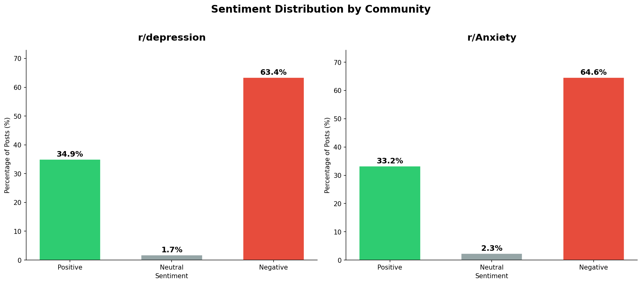
The comparison between r/depression and r/Anxiety is the first genuinely interesting finding — and it is also the most surprising for its lack of difference. r/depression sits at 63.4% negative; r/Anxiety at 64.6%. A gap of just 1.2 percentage points. Both communities also have almost no neutral posts: 1.7% and 2.3% respectively. People writing in these spaces are not hedging. They are not neutral. The language is almost entirely at one end or the other, with very little in between.
Graph 2 — Sentiment Distribution Across All Communities
fig, ax = plt.subplots(figsize=(13, 6))

order = ['depression', 'Anxiety', 'stress', 'mentalhealth', 'bipolar']
palette_violin = sns.color_palette("husl", len(order))

sns.violinplot(data=df, x='subreddit', y='vader_compound',
               order=order, palette=palette_violin,
               inner='quartile', linewidth=1.2, ax=ax)

ax.axhline(y=0, color='black', linestyle=':', linewidth=1, alpha=0.5)
ax.set_title('Sentiment Score Distribution Across Communities',
             fontsize=16, fontweight='bold', pad=20)
ax.set_xlabel('Community')
ax.set_ylabel('VADER Compound Score')
ax.set_xticklabels([f'r/{s}' for s in order])

plt.tight_layout()
plt.savefig('plot_05_sentiment_distribution_violin.png', dpi=150, bbox_inches='tight')
plt.show()
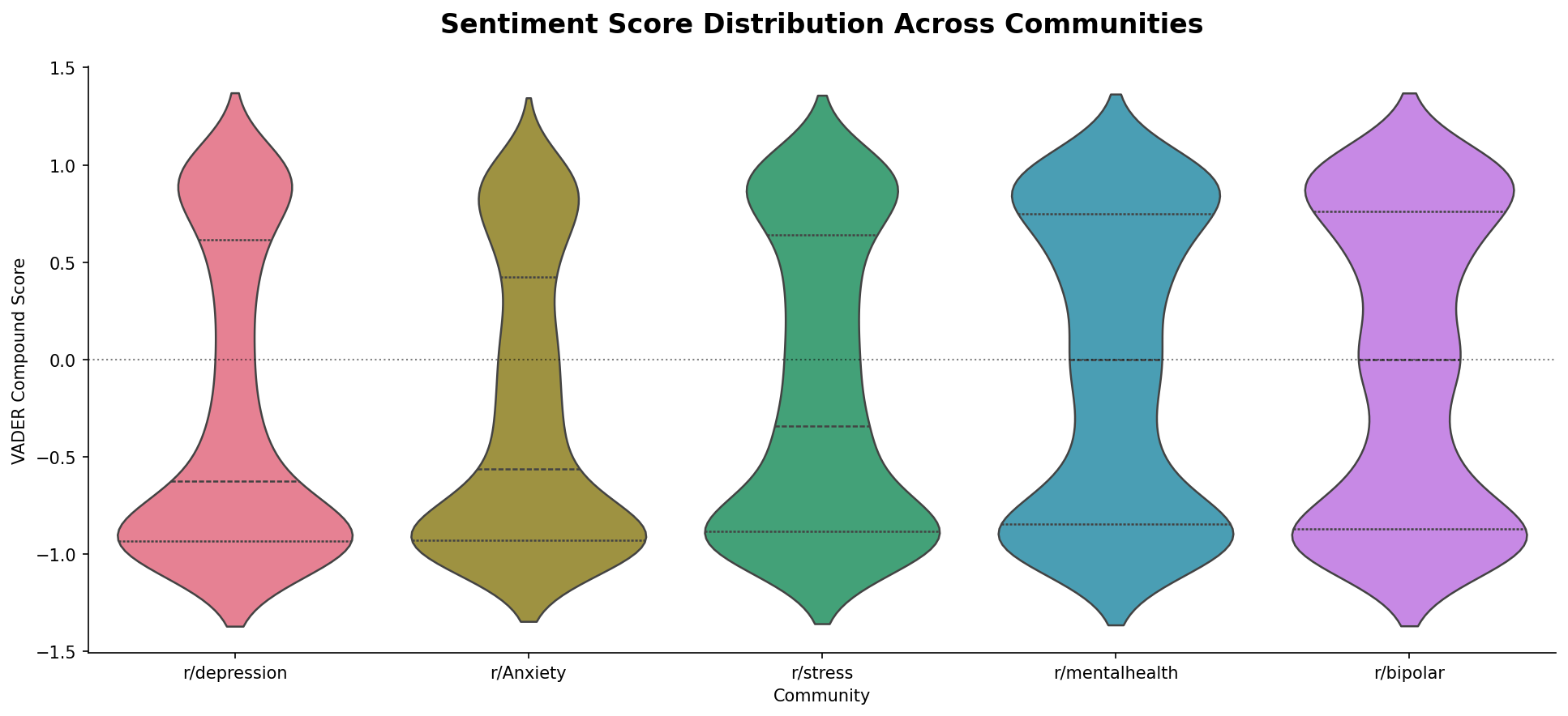
The violin plot reveals something bar charts hide: the shape of the distribution. r/depression has the most concentrated distribution of all five communities — its mass sits heavily at the bottom, clustered near -1, with a narrow waist above that. r/Anxiety follows a similar shape. Both are pulled sharply negative. r/stress sits between those extremes and the more general communities.
r/mentalhealth and r/bipolar look entirely different. Both have wide, roughly symmetric shapes that spread across the full range from -1 to +1, with their midpoints close to zero. A wider distribution does not mean more positive — it means more variability. These communities contain both the most distressed posts and the most hopeful ones.
r/depression has the most concentrated distribution — mass clustered near -1. r/mentalhealth and r/bipolar are the widest, spreading across the full range. The difference is not in how negative they are but in how varied.
Graph 3 — Word Frequency Analysis
from collections import Counter

fig, axes = plt.subplots(1, 2, figsize=(14, 8))

domain_stops = {'like', 'just', 'really', 'know', 'think', 'feel',
                'im', 'dont', 'ive', 'its', 'got', 'get', 'want',
                'would', 'could', 'going', 'one', 'even', 'also'}

for i, sub in enumerate(['depression', 'Anxiety']):
    text_data = ' '.join(df[df['subreddit'] == sub]['cleaned_no_stops'].dropna())
    words = [w for w in text_data.split() if w not in domain_stops and len(w) > 3]

    top_words = Counter(words).most_common(20)
    words_list, counts = zip(*top_words)

    axes[i].barh(list(reversed(words_list)), list(reversed(counts)),
                 color=sns.color_palette("husl", 20))
    axes[i].set_title(f'r/{sub} — Top 20 Words', fontsize=14, fontweight='bold', pad=15)
    axes[i].set_xlabel('Frequency')

plt.suptitle('Most Frequent Words by Community', fontsize=16, fontweight='bold', y=1.01)
plt.tight_layout()
plt.savefig('plot_06_word_frequency.png', dpi=150, bbox_inches='tight')
plt.show()
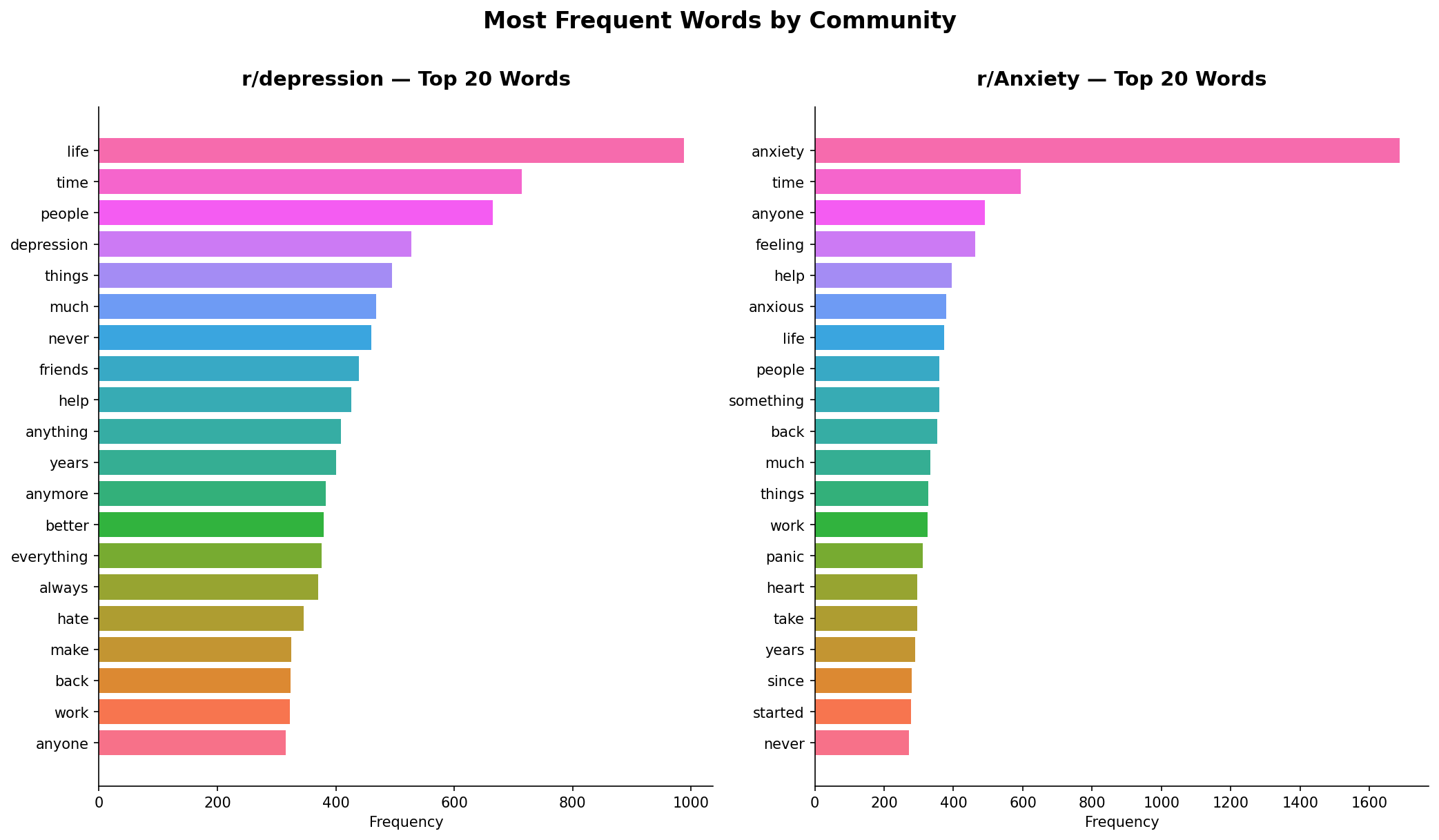
The word frequency comparison reveals something that raw sentiment scores miss entirely. r/depression’s top words are “life”, “time”, “people”, “never”, “anything”, “always”, “hate”. The language is broad and existential — words about existence itself, about duration, about absence. “Never” and “anymore” appearing high on the list reflect how depression gets described: as something that has closed off possibility, that has been going on too long.
r/Anxiety tells a completely different story at the top of the chart. “Anxiety” itself is the dominant word by a significant margin — far ahead of anything else. Below it sits “feeling”, “help”, “anxious”, “panic”, “heart”, “started”. This is symptom language. People in r/Anxiety are naming what is happening to their body: racing heart, panic, the onset of symptoms. The word “started” suggests people locating the beginning of something — when it began, what triggered it.
Two communities with significant overlap in their experiences, but one describes a state of being and the other describes a physical event.
Graph 4 — Sentiment Component Heatmap
heatmap_data = df.groupby('subreddit')[['vader_pos', 'vader_neu', 'vader_neg']].mean()
heatmap_data.columns = ['Positive', 'Neutral', 'Negative']
order_heat = ['depression', 'Anxiety', 'stress', 'mentalhealth', 'bipolar']
heatmap_data = heatmap_data.reindex(order_heat)

fig, ax = plt.subplots(figsize=(10, 6))
sns.heatmap(heatmap_data,
            cmap='RdYlGn',
            annot=True,
            fmt='.3f',
            linewidths=0.5,
            ax=ax,
            cbar_kws={'label': 'Mean Score'})

ax.set_title('Sentiment Component Breakdown by Community',
             fontsize=16, fontweight='bold', pad=20)
ax.set_xlabel('Sentiment Component')
ax.set_ylabel('Community')
ax.set_yticklabels([f'r/{s}' for s in order_heat], rotation=0)
plt.tight_layout()
plt.savefig('plot_07_sentiment_heatmap.png', dpi=150, bbox_inches='tight')
plt.show()
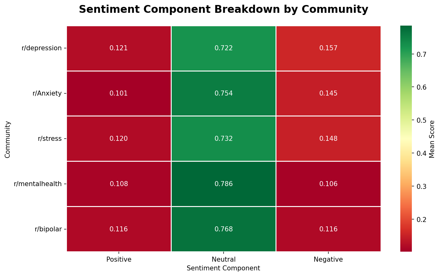
The heatmap breaks compound scores into their three components, and the dominant finding is one that the compound score alone obscures: neutral is the largest component in every single community, ranging from 0.722 to 0.786. Most of the words in these posts, on a per-word basis, are not emotionally coded at all. The emotional weight comes from a smaller portion of the text.
The differences between communities sit in the negative column. r/depression has the highest negative component at 0.157 — the only community above 0.15. r/mentalhealth sits at 0.106, the lowest of all five, and also has the highest neutral score at 0.786. r/mentalhealth posts use the most emotionally flat language, which makes sense: a general mental health community attracts more informational posts, resource sharing, and moderation content alongside personal disclosures.
Graph 5 — Post Length vs Sentiment
fig, axes = plt.subplots(1, 2, figsize=(14, 6))

sample = df.sample(min(5000, len(df)), random_state=42)

for i, sub in enumerate(['depression', 'Anxiety']):
    sub_sample = sample[sample['subreddit'] == sub]

    axes[i].scatter(sub_sample['text_length'].clip(upper=400),
                    sub_sample['vader_compound'],
                    alpha=0.2, s=15,
                    color=sns.color_palette("husl", 2)[i])

    from numpy.polynomial.polynomial import polyfit
    x = sub_sample['text_length'].clip(upper=400).values
    y = sub_sample['vader_compound'].values
    mask = ~np.isnan(x) & ~np.isnan(y)
    if mask.sum() > 10:
        b, m = polyfit(x[mask], y[mask], 1)
        x_line = np.linspace(x.min(), x.max(), 100)
        axes[i].plot(x_line, b + m * x_line,
                     color='#E74C3C', linewidth=2.5, label=f'Trend (slope={m:.5f})')

    axes[i].axhline(y=0, color='black', linestyle=':', alpha=0.4)
    axes[i].set_title(f'r/{sub} — Length vs Sentiment', fontsize=14, fontweight='bold')
    axes[i].set_xlabel('Post Length (words)')
    axes[i].set_ylabel('VADER Compound Score')
    axes[i].legend()

plt.suptitle('Post Length vs Sentiment Score', fontsize=16, fontweight='bold', y=1.01)
plt.tight_layout()
plt.savefig('plot_08_length_vs_sentiment.png', dpi=150, bbox_inches='tight')
plt.show()
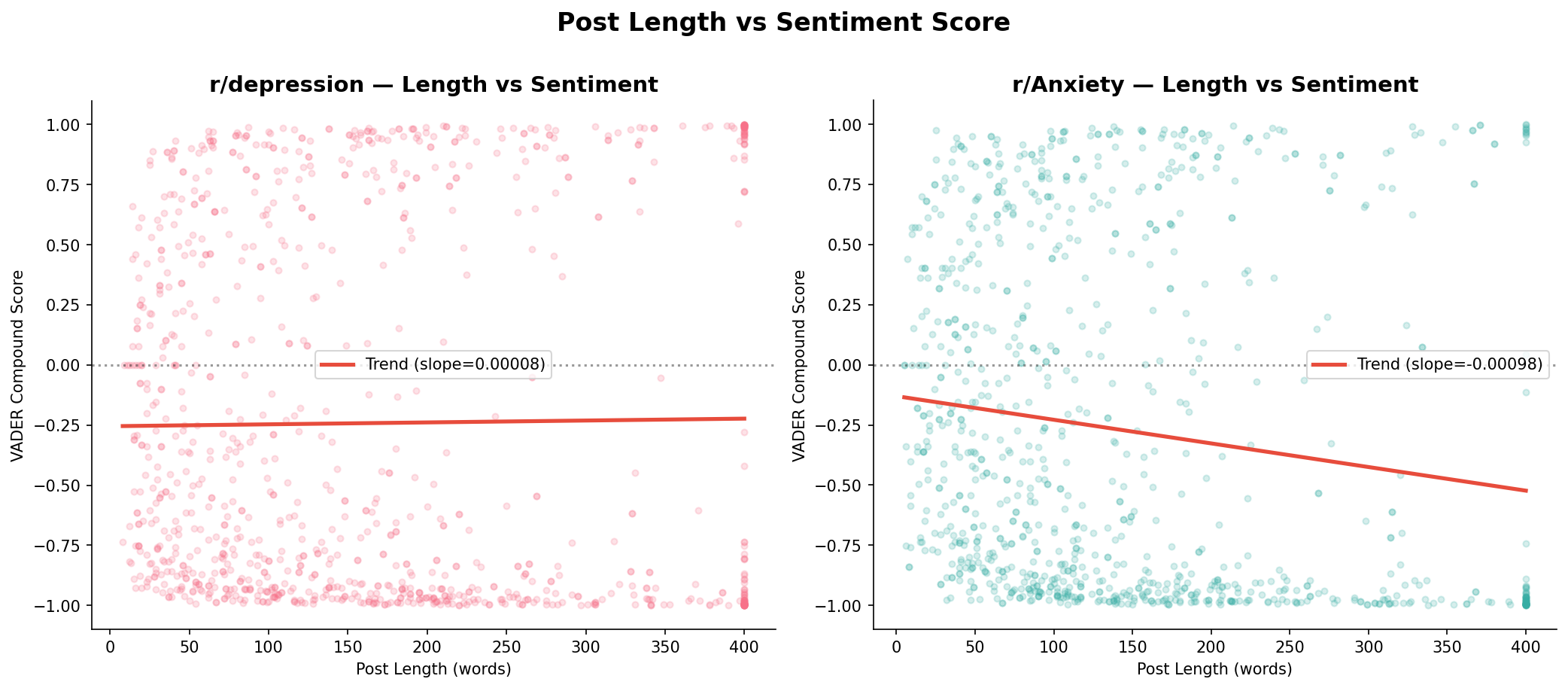
The two communities behave differently here. r/depression’s regression line is essentially flat — slope of 0.00008, which is effectively zero. In this community, post length tells you almost nothing about how positive or negative the post will be. Short posts and long posts score similarly on average.
r/Anxiety shows a different pattern. The slope is -0.00098 — still small in absolute terms, but a genuine negative trend. Longer posts in r/Anxiety tend to score slightly more negative. The intuition makes sense: a brief anxiety post might be “feeling anxious today”, while a longer one is more likely to be someone working through a difficult situation in detail, which adds more negatively-coded language as it goes.
In both cases the scatter is wide. Trend lines describe the average, not the individual post. There are long, highly positive posts in both communities — detailed accounts of therapy progress, of finding a medication that works, of small things improving. Length does not determine sentiment. In r/Anxiety it weakly predicts it; in r/depression it does not predict it at all.
What This Analysis Can and Cannot Tell You
This is the part worth reading carefully before drawing conclusions from any mental health data analysis.
VADER was trained on social media text and product reviews. Mental health language frequently works against its assumptions. When someone writes “I feel nothing” in a depression post, VADER scores this as neutral or slightly negative. The word “nothing” by itself is not particularly negative in VADER’s dictionary. But in the context of depression, “feeling nothing” is one of the most clinically significant statements a person can make. The algorithm does not know that.
The same applies to irony, understatement, and the specific ways people describe psychological pain. “I am fine” scores positive. “I should be happy but I’m not” scores slightly positive because of “happy”. The gap between what language literally says and what it means in mental health contexts is exactly where VADER’s rule-based approach struggles.
The gap between what language literally says and what it means in mental health contexts is exactly where VADER’s rule-based approach struggles. Individual post scores should be treated with scepticism.
This does not invalidate the aggregate findings. At scale, the directional patterns are meaningful. But individual post scores should be treated with scepticism, and any conclusion drawn from this data should be framed as “the language used in these communities tends to pattern this way” rather than “these people are feeling this.”
That distinction is not academic. It is the difference between using data responsibly and using data carelessly.
What I Actually Took Away From This
I went into this expecting to find a simple story. More negative posts in communities focused on clinical conditions. Anxiety scoring differently from depression. The results confirming whatever intuition I started with.
Some of those things are true, directionally. But the pattern that stayed with me is harder to summarise. These communities are persistently used. The baseline oscillates but it holds. People arrive, they write, they receive responses, they come back.
There is something worth acknowledging in that. Whatever their limitations as safe spaces, these communities function as stable environments for people who need somewhere to put their words. The data reflects that use — not as a clinical record of mental health, but as evidence that a lot of people are looking for a place to be honest about how they feel, and they keep coming back to these corners of the internet to do it.
That is not a data insight. It is a human one. The data just made it visible.
Full Code at a Glance
import pandas as pd
import numpy as np
import matplotlib.pyplot as plt
import seaborn as sns
from collections import Counter
from vaderSentiment.vaderSentiment import SentimentIntensityAnalyzer
from numpy.polynomial.polynomial import polyfit
import re
import nltk
from nltk.corpus import stopwords
import warnings
warnings.filterwarnings('ignore')

nltk.download('stopwords', quiet=True)
Mohun Shakeel Ahmad — Software Engineer at Spoon Consulting / SharinPix. MSc Data Science (Distinction), Sunway University. Writing about tech, data and software for people who want to understand what is actually going on.